New website
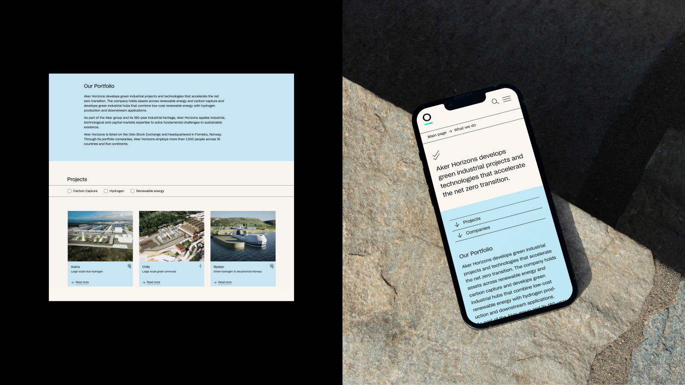
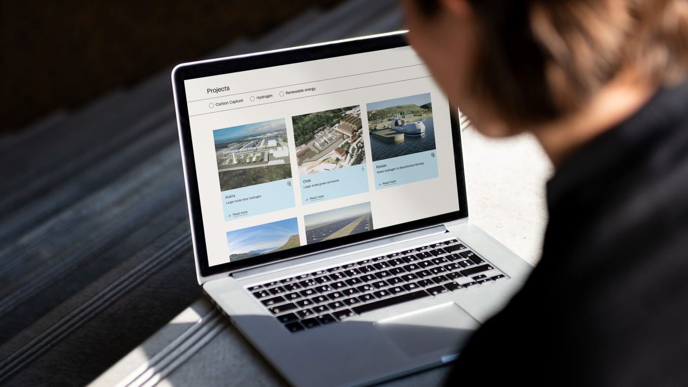
Aker Horizons is accelerating the shift to net zero by developing renewable energy and green industries. They move with urgency, and needed a new website to better showcase their work and vision, as well as share information about their crucial projects with stakeholders and shareholders. The purpose of launching a new website was to improve functionality, craft corporate storytelling, and lay the groundwork for new business developments and communications products. This meant they also needed a new visual identity to reflect the transformation they have undergone since inception – from a Norwegian investment company to a global developer of green industrial projects and technologies. Their target audiences are investors, partners, NGOs, as well as future and current employees.
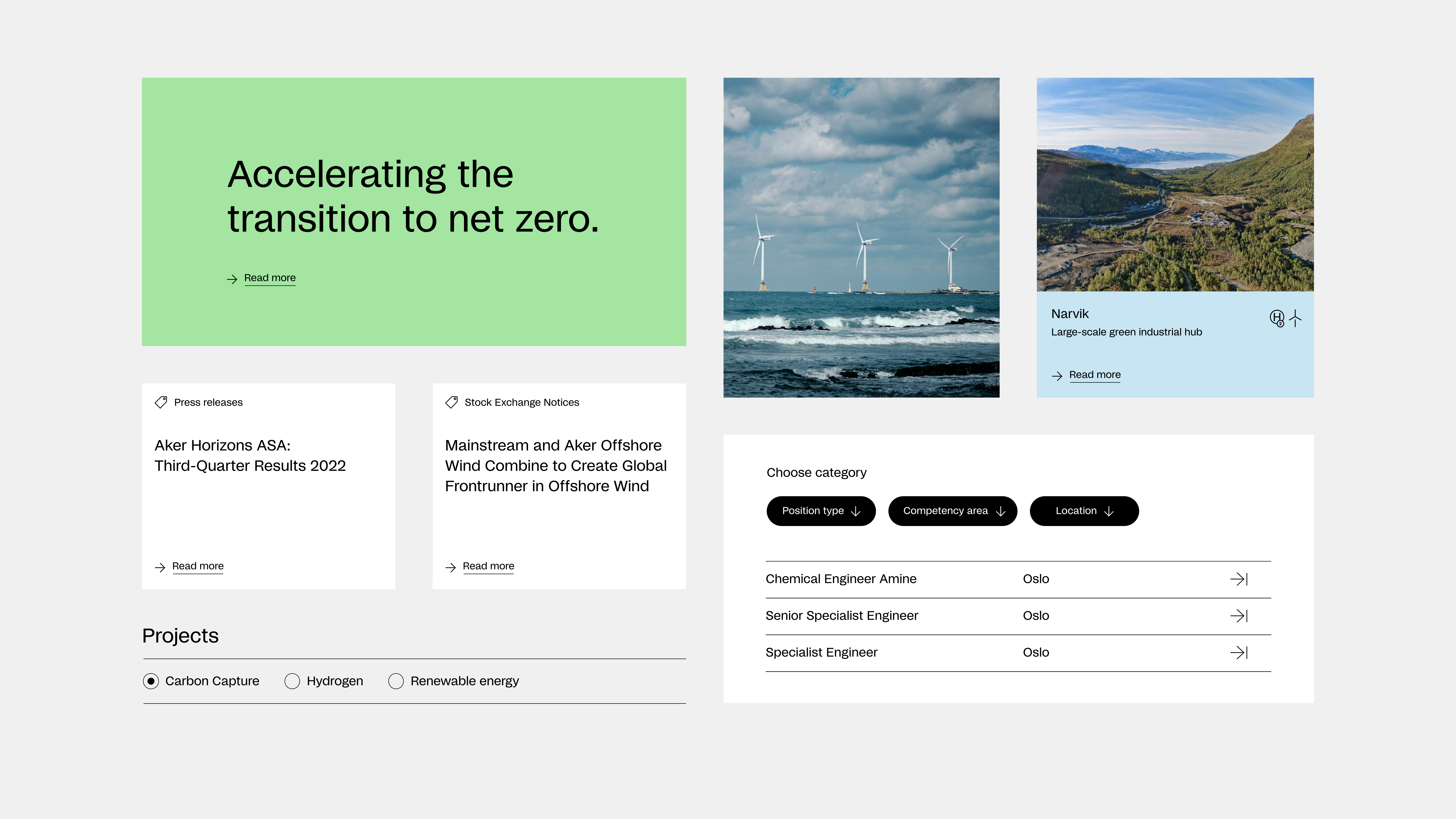
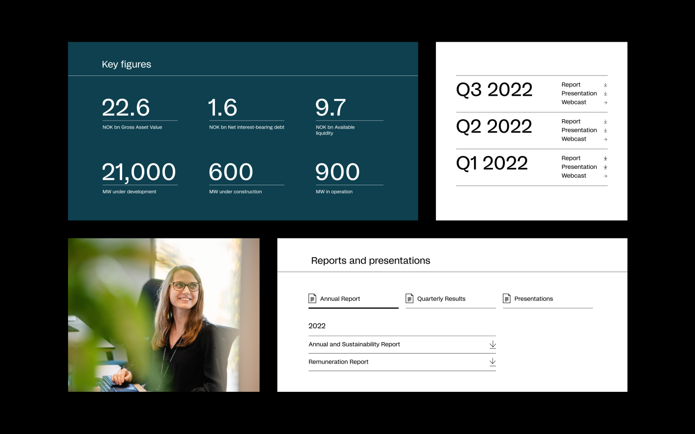
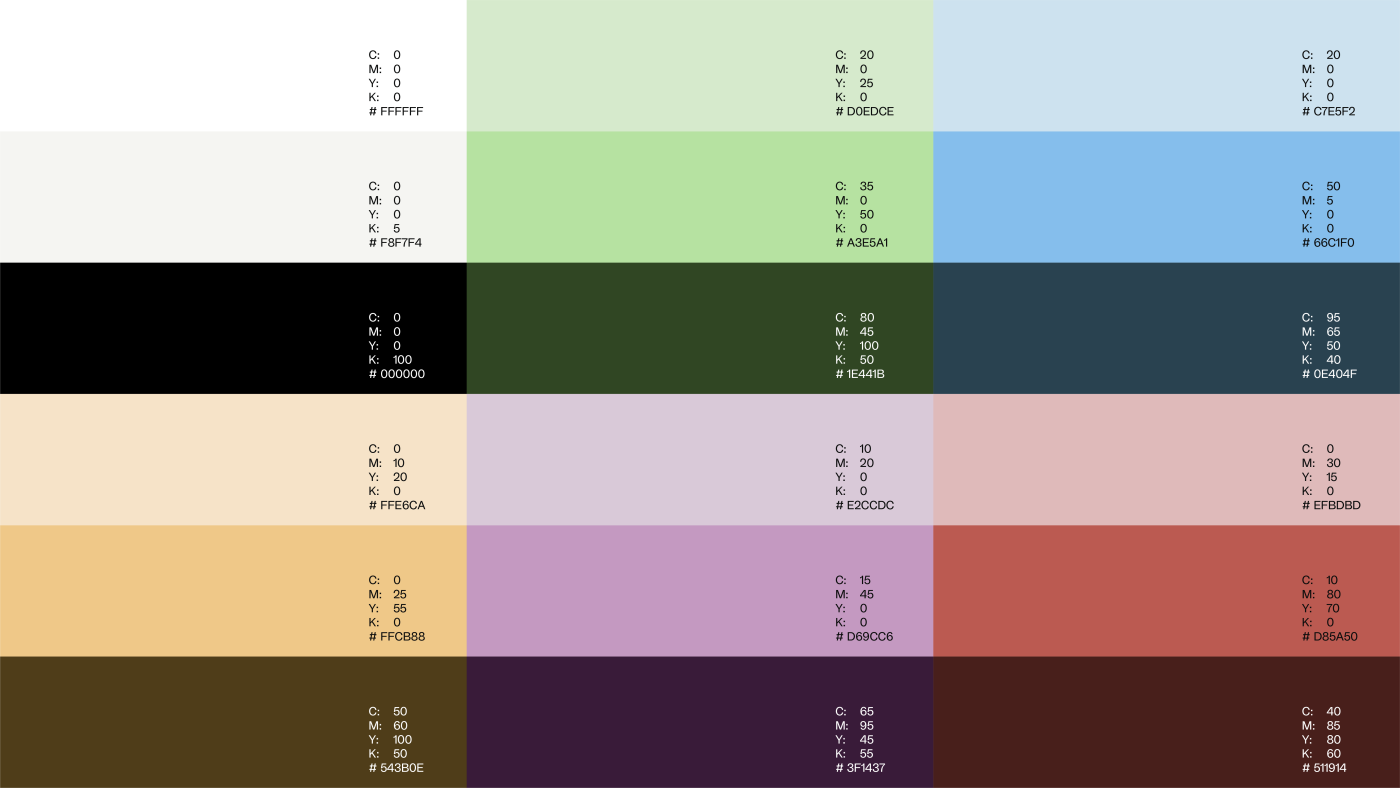
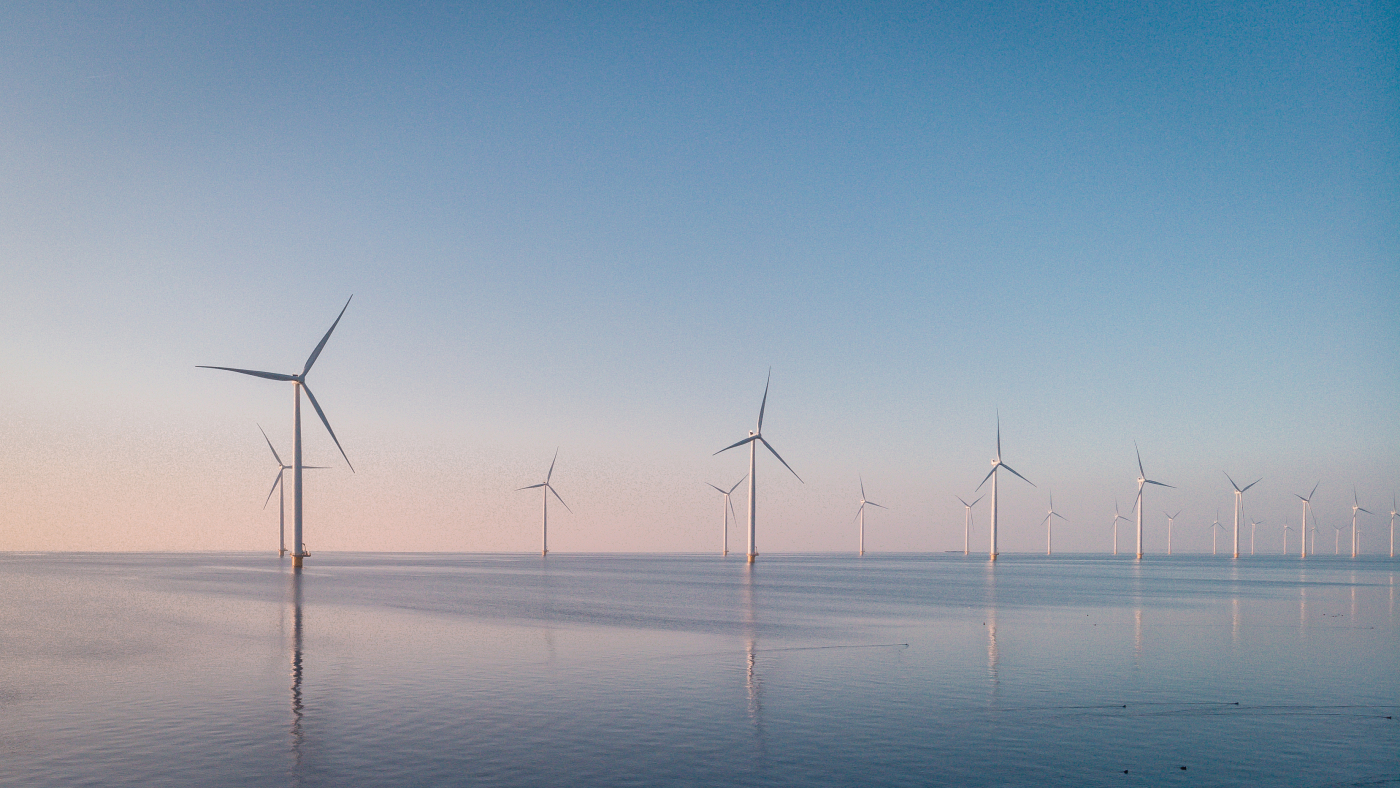
The new site needed to be clear, engaging and visually expressive, through its messaging and financial content. We made a colour palette that reflects the name and logo, featuring a wide range from the sky and sunrise – with green and blue, to emphasise industry and green energy.
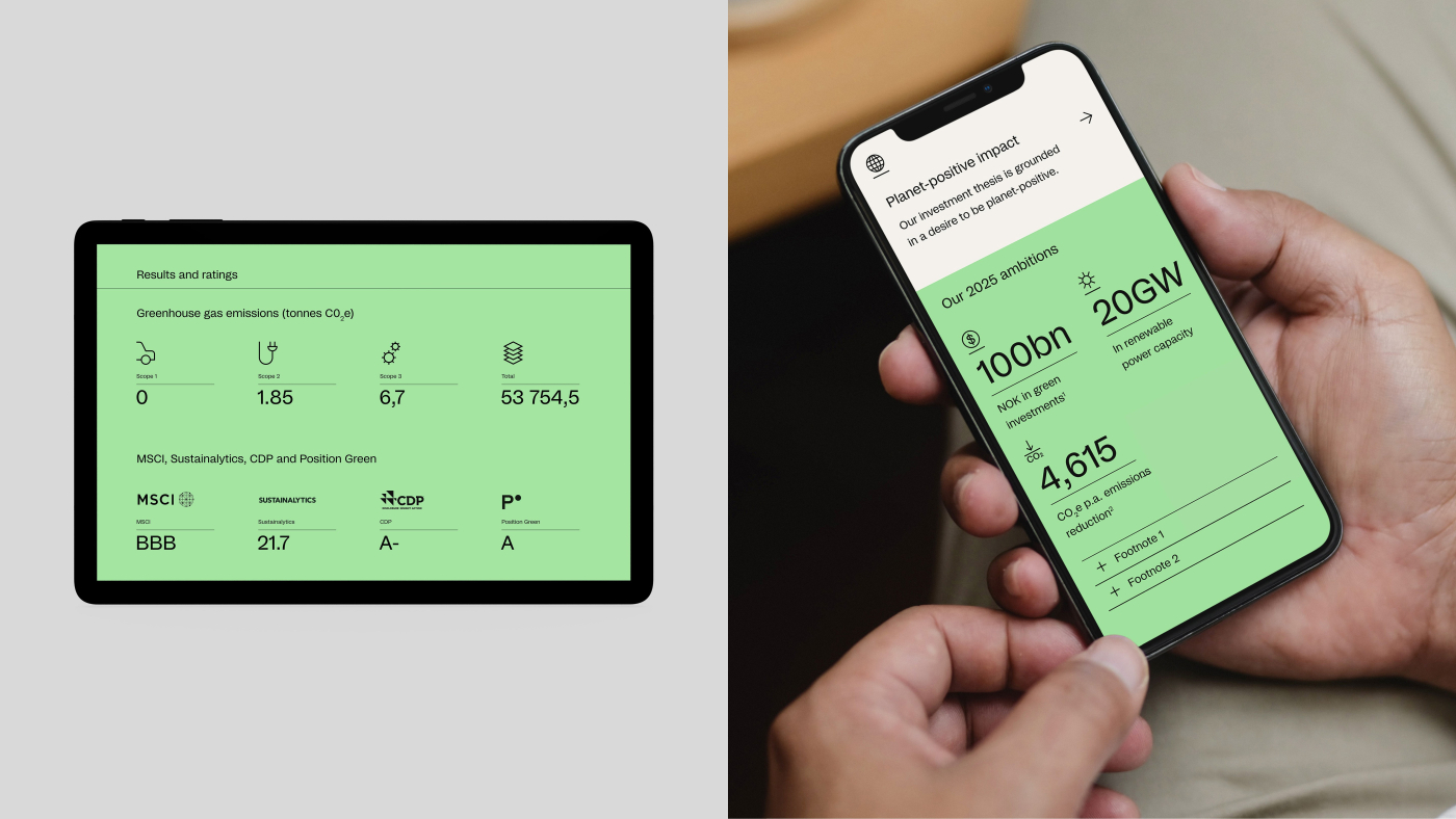
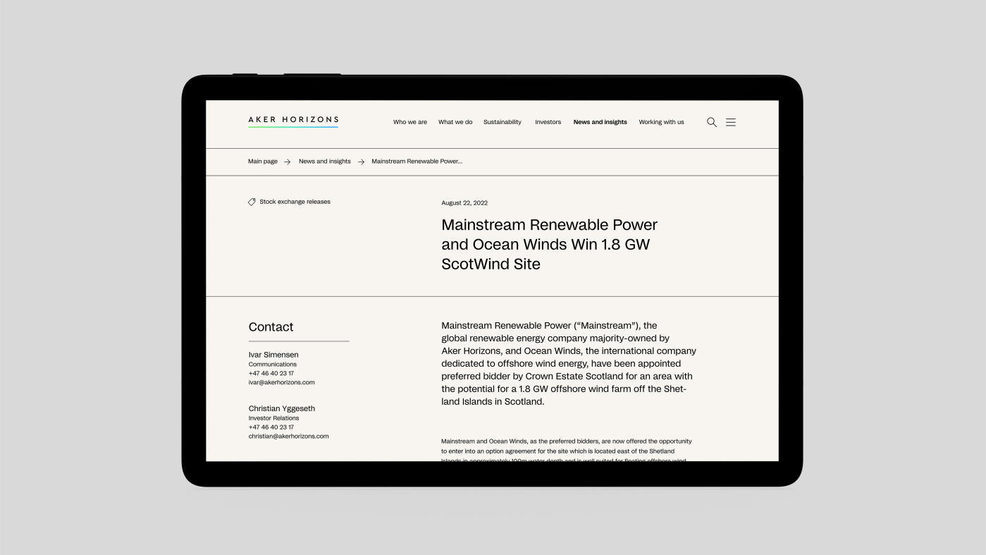
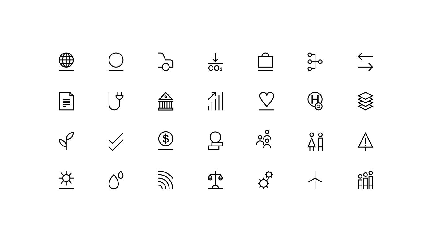
A rich library of simple and understandable icons is used as a visual and functional aid throughout the site, as decorative elements, support text, and highlight content. We supplemented the global menu with a mega menu, to give the user a total overview of the content and to facilitate navigation.
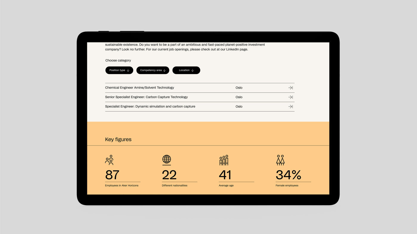
On the landing pages, we added anchor points to easily take the user to the desired content. Throughout the layout, we used a combination of calm text sections with pictures to promote balance. To further explain the content and generate a more exciting experience, we sprinkled the pages with infographics, icons, interactive slideshows and pop-up photos, thus creating better storytelling and strengthening the brand.
