Vespa
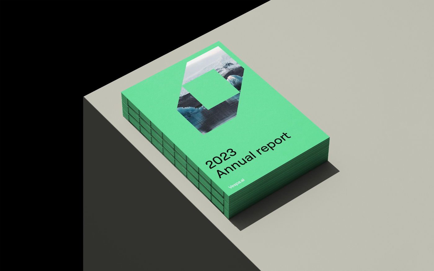
After spinning out of Yahoo as an independent company, Vespa unveil a new visual identity. The overall brand reflects their personality as a bold, Scandinavian company.
Vespa delivers a platform powering all kinds of use cases combining AI and data, and have employees all around the world. Their headquarters and engineering hub remains in Trondheim.
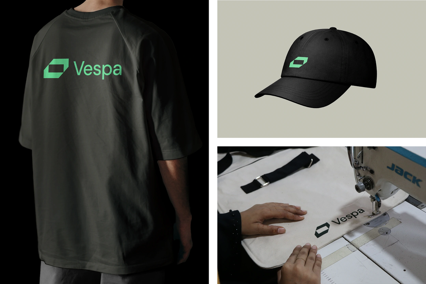
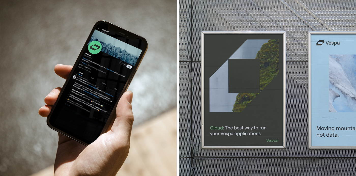
The geometric and forward-leaning logo is inspired by the no-nonsense and unbeatable performance of the platform. The symbol can be interpreted as a simple box, the initial letter V or brackets. But – it can also be seen as a three-dimensional and scalable container of data, thus answering the concept of “Moving mountains, not data”.
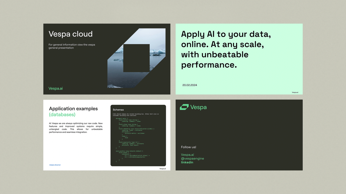
The colour scheme picks up on elements from Scandinavian nature such as heather, rocks, light, and glaciers – as does the photographic style: Vespa is solid like mountains, agile like water, and complex like a finely tuned ecosystem.


The typographic palette ensures a professional yet available tone of voice and cross-platform legibility. Roobert is a monolinear geometric sans serif that is somewhat technical yet still friendly and inviting.

Vespa’s brand images are interpertations of their competences – a sturdy ecosystem of connected elements – translated to the rough scandinavian nature of which they have their origins.


Together with the 45° from the logo and thin hairlines, the custom icon library points to Vespa’s high level of performance and precision. The icons pair with type to make sure the complex concepts are easily understood.

Incredibly fun to see the whole project come together in this way. Tank Design has put in a lot of work in what has become a very good, complete, visual profile that all comes together in the brand guidelines.
Frode Lundgren, Founder & CTO
